CASE STUDY: Library of Things
Challenge
The Library of Things is a circulating collection of non-traditional items for youth and adults, spanning five categories: Health & Accessibility, Learning, Home/DIY, Electronics, and Entertainment. Items range from STEM kits and puzzles to laptops, hotspots, musical instruments, and practical tools.
The project required a unified brand and operational system that could support four distinct audiences—community members borrowing items, staff managing item data, operations handling packaging and labeling, and fulfillment staff lending items—while remaining visually connected to the main organization.
The core challenge was to design a single, scalable system that balanced accessibility, clarity, and operational efficiency across a large and evolving inventory.
My Role
I led the end-to-end design of the Library of Things brand and system, with a focus on accessibility, scalability, and cross-team workflows.
Designed a custom Library of Things brand that clearly differentiated the collection while maintaining visual alignment with the main organization
Developed accessible visual standards for youth and adult collections, using high-contrast typography and a color-coded category system
Created modular templates for item cards, packaging, labels, and barcodes, allowing staff to generate consistent materials for 100+ items without design support
Researched and tested materials, sizes, and production methods to ensure durability, legibility, and efficient checkout and shelving
Collaborated with multiple departments to map workflows and ensure the system supported item tracking, lending, and maintenance
Solution
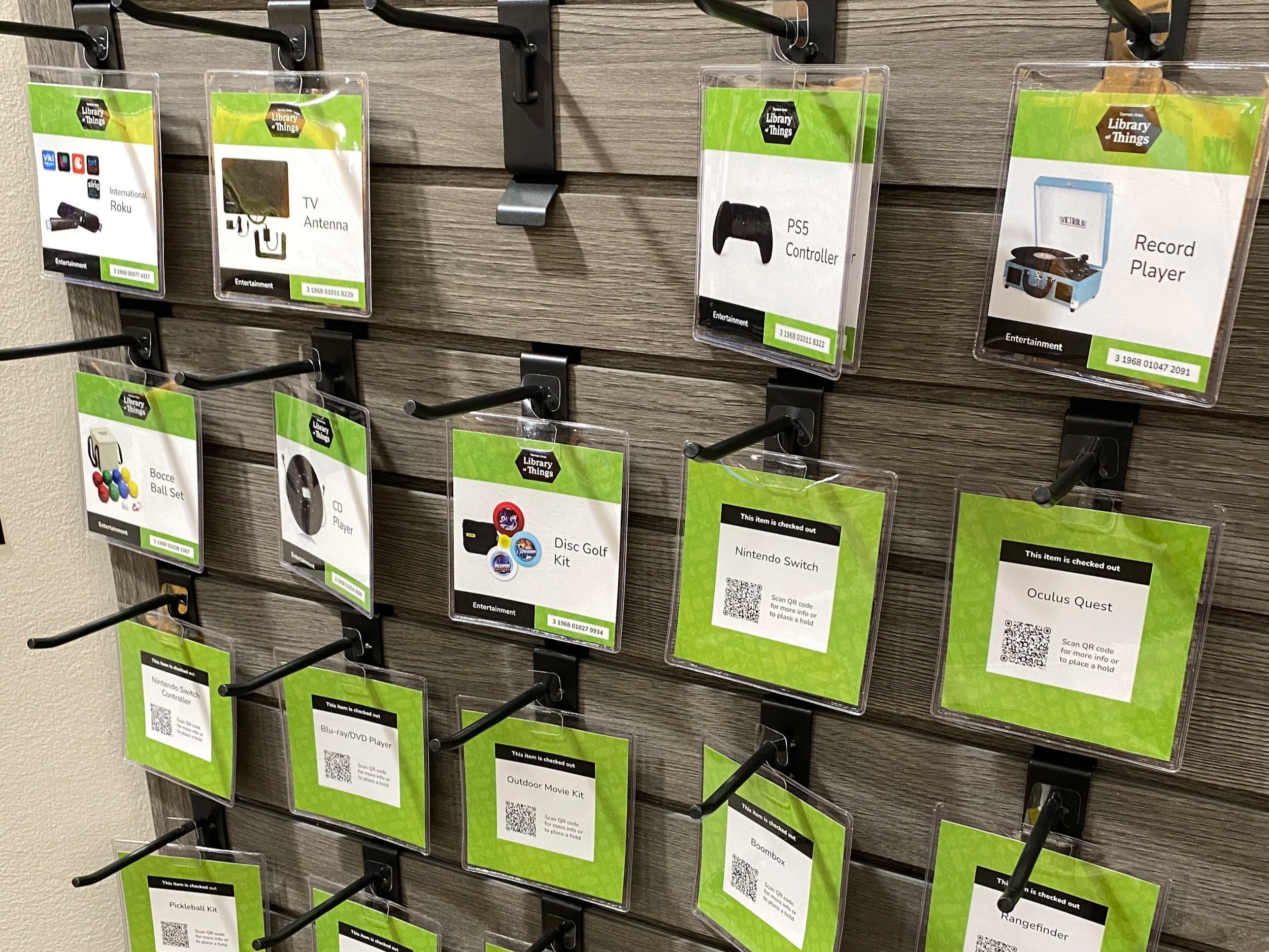
The solution was a modular, card-based system that streamlines discovery and fulfillment. Users browse a physical wall of item cards and bring selections to staff, while back-end tags and labels support efficient tracking and lending.
The system accommodates multiple copies of items, supports rapid onboarding of new items, and remains consistent across all touchpoints—cards, packaging, labels, and internal workflows—without requiring redesign as the collection grows.
Results
Successfully launched and used daily by staff and community members
Reduced staff effort through standardized templates and clear workflows
Improved accessibility and confidence for users browsing unfamiliar items
Enabled seamless expansion of a diverse inventory
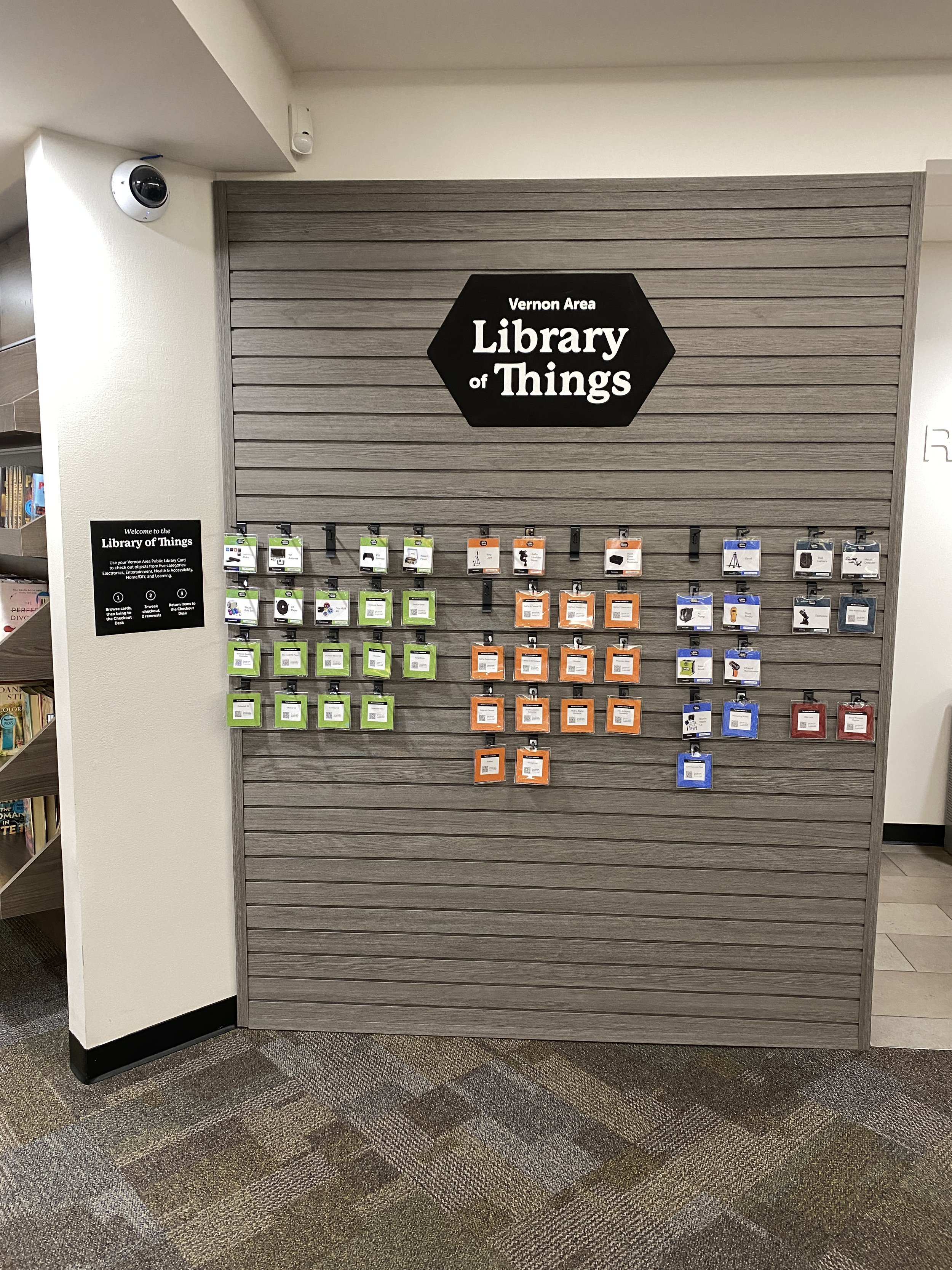
The main Library of Things display operates through item cards, which users bring to the Checkout Desk to borrow objects.
Reusable card pockets minimize plastic waste and j-hooks allow for easy browsing of stacked categories.
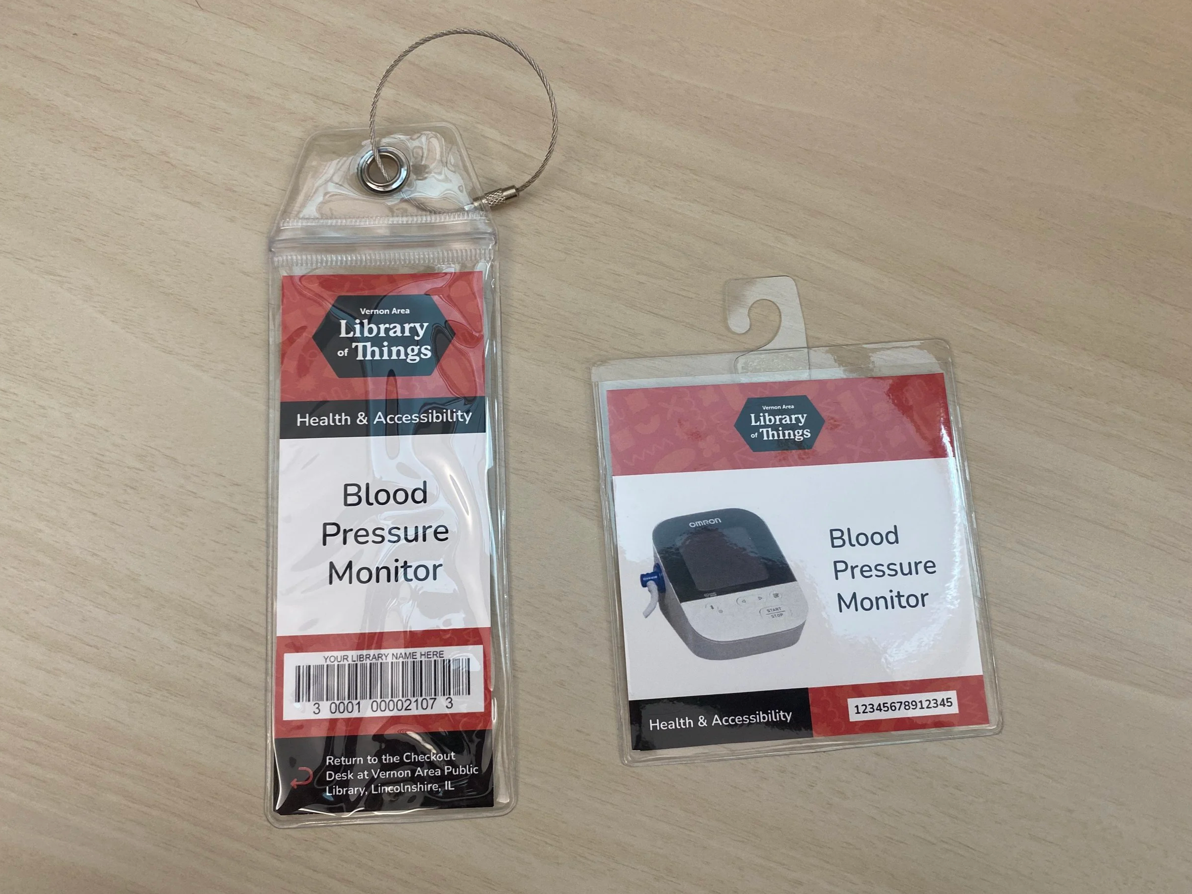
Once users bring their selected checkout cards to the Checkout Desk, staff match each card to a tag attached to the item and then retrieve the item for the user.
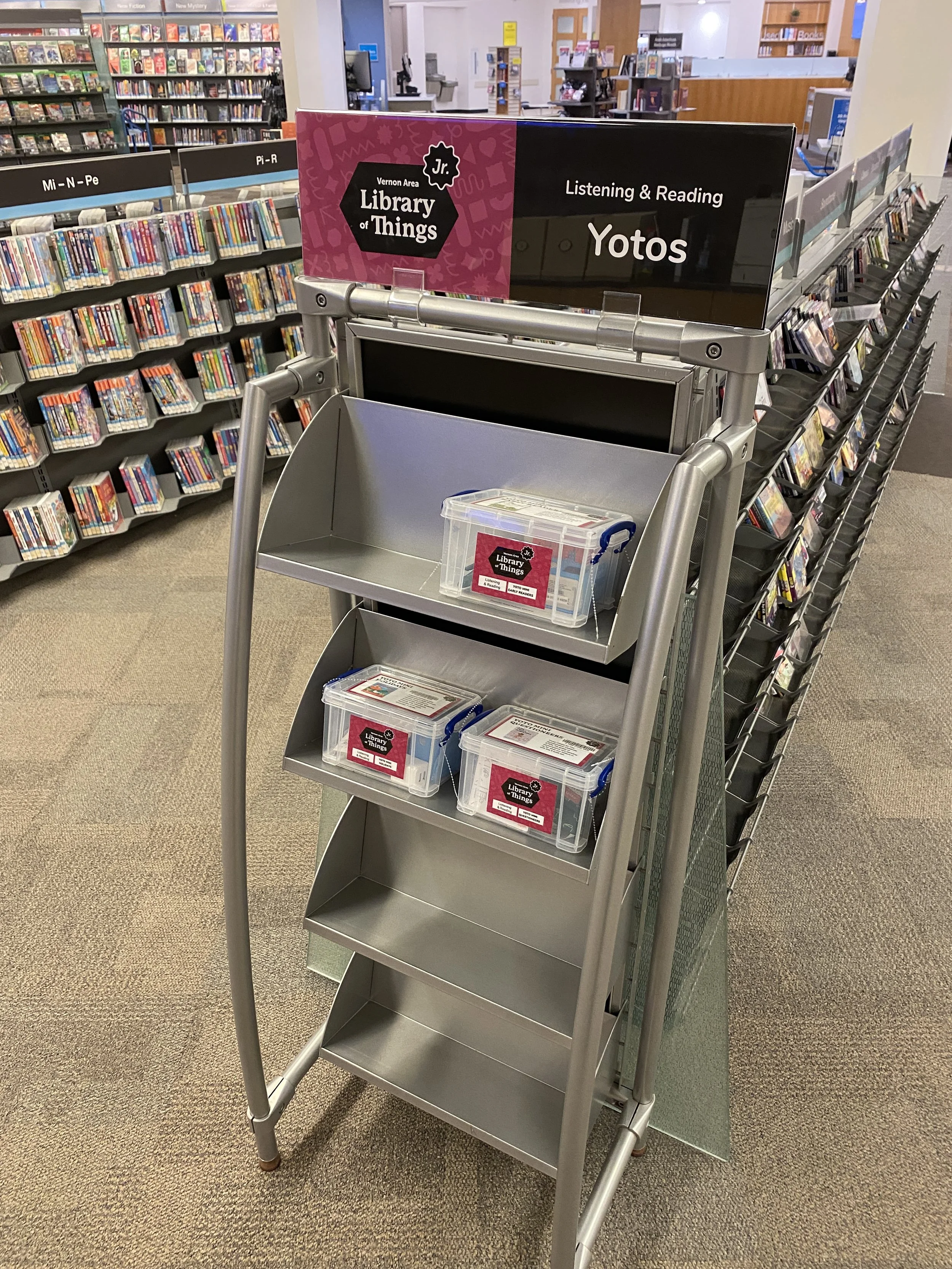
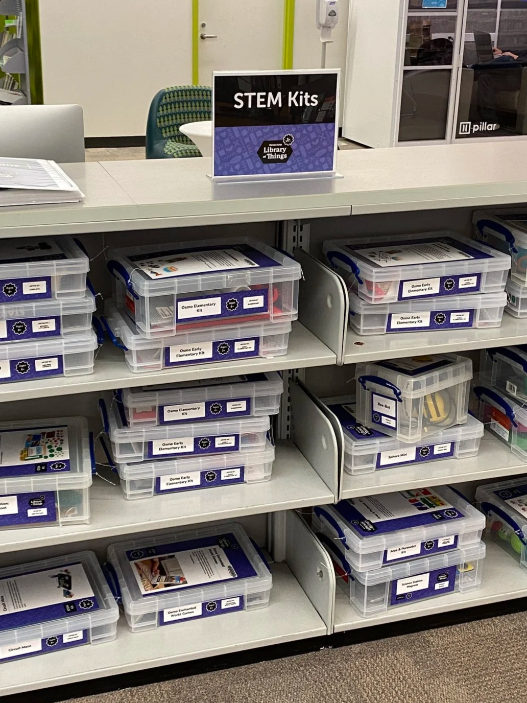
The youth collection, Library of Things Jr., is displayed separately in the Youth Department and enables direct, self-serve access to items.
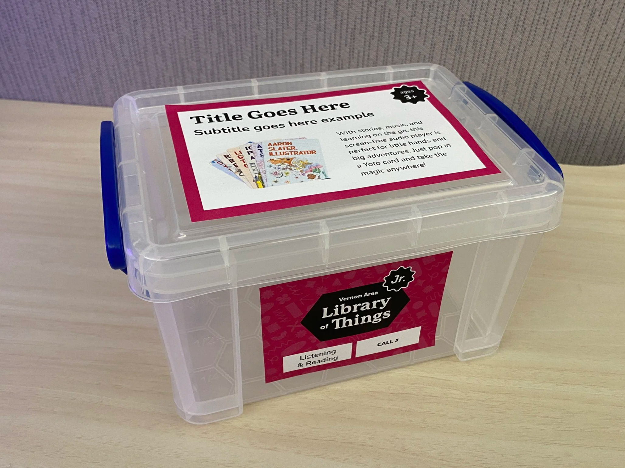
Library of Things Jr. packaging features multi-sided labels in a set of standard sizes that communicate item descriptions and checkout information.